Chapter 3 Exploratory Spatial Data Analysis
Exploratory spatial data analysis (ESDA) was performed to gain an insight into the spatial patterns that are present in the data. This ESDA was used to support our decision when choosing the most appropriate models.
3.1 London Greenspace distribution
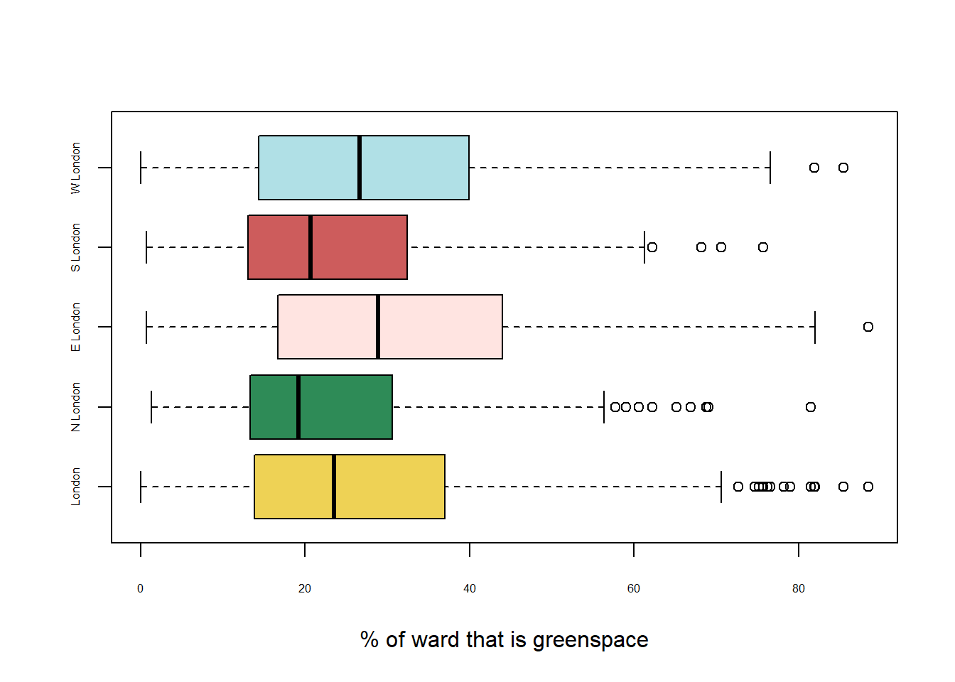
Figure 3.1: Box plots of green space distribution in sub-sections of London.
London is a highly urban city with a considerable number of wards comprised of less than 11.9% green space. The median percentage of green space across Greater London was 23.5%.
The study area has been evenly divided into 4 sections: North, East, South and West London. The boundaries of these areas were decided by considering adjacency and similarity of characteristics. Figure 3.1 illustrates how the four regions of London differ in terms of access to green space. North London has the lowest median % of green space, followed by South London, West London and finally East London. North London displays the highest positive skew, with South London also being positively skewed, whilst East and West London are more normally distributed.
3.2 Demographic distribution across London
3.2.1 Income
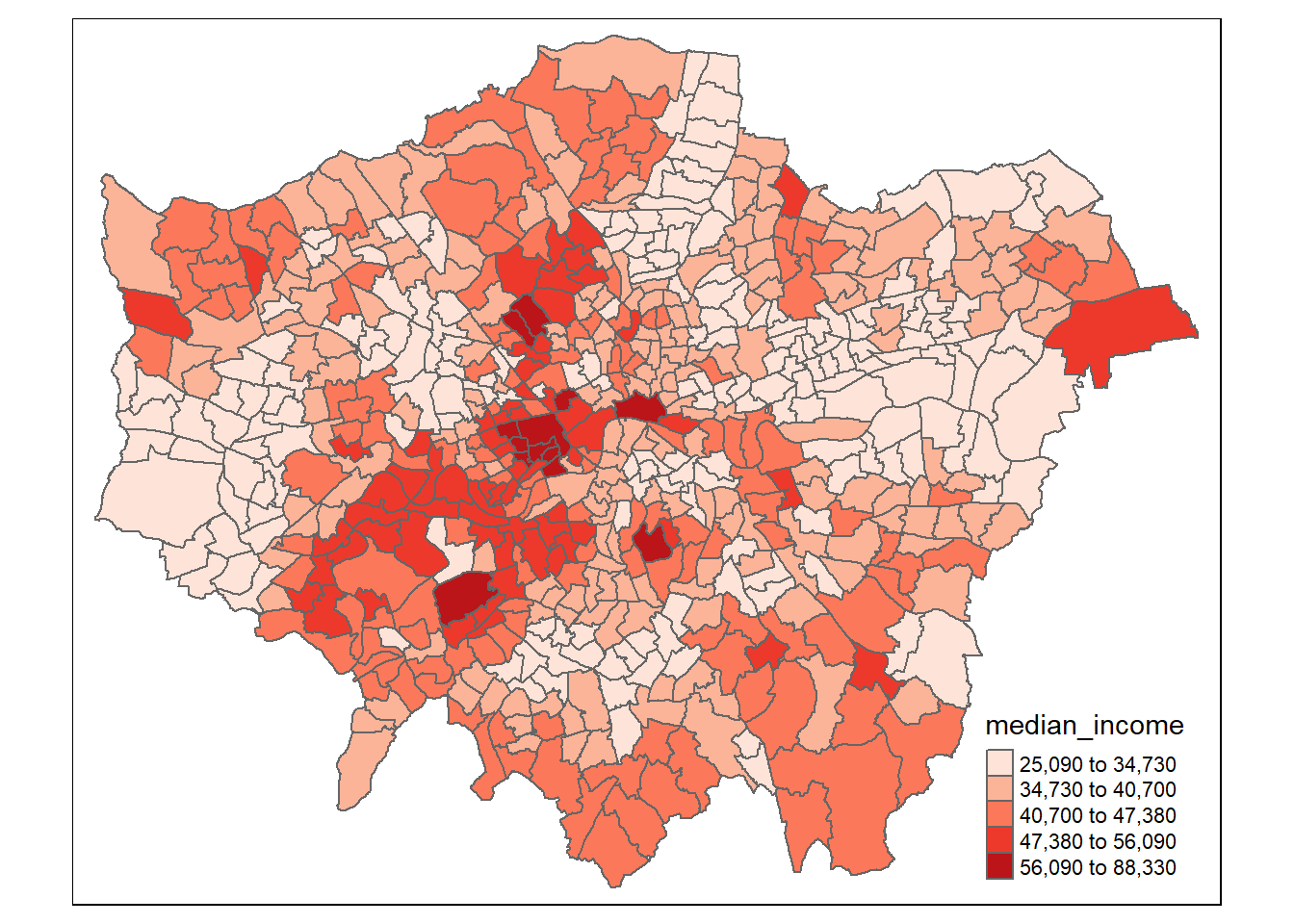
Figure 3.2: Plot of Median Income per ward in Greater London
As seen in Figure 3.2, the wards with the highest median incomes (above £56,000) are found in areas of London such as Kensington and Chelsea, Richmond an Hampstead. In comparison, those with the lowest median incomes are located on the periphery of the city, particularly towards the West and East, with a section of low income wards along the River Lea valley in the North.
3.2.2 Age
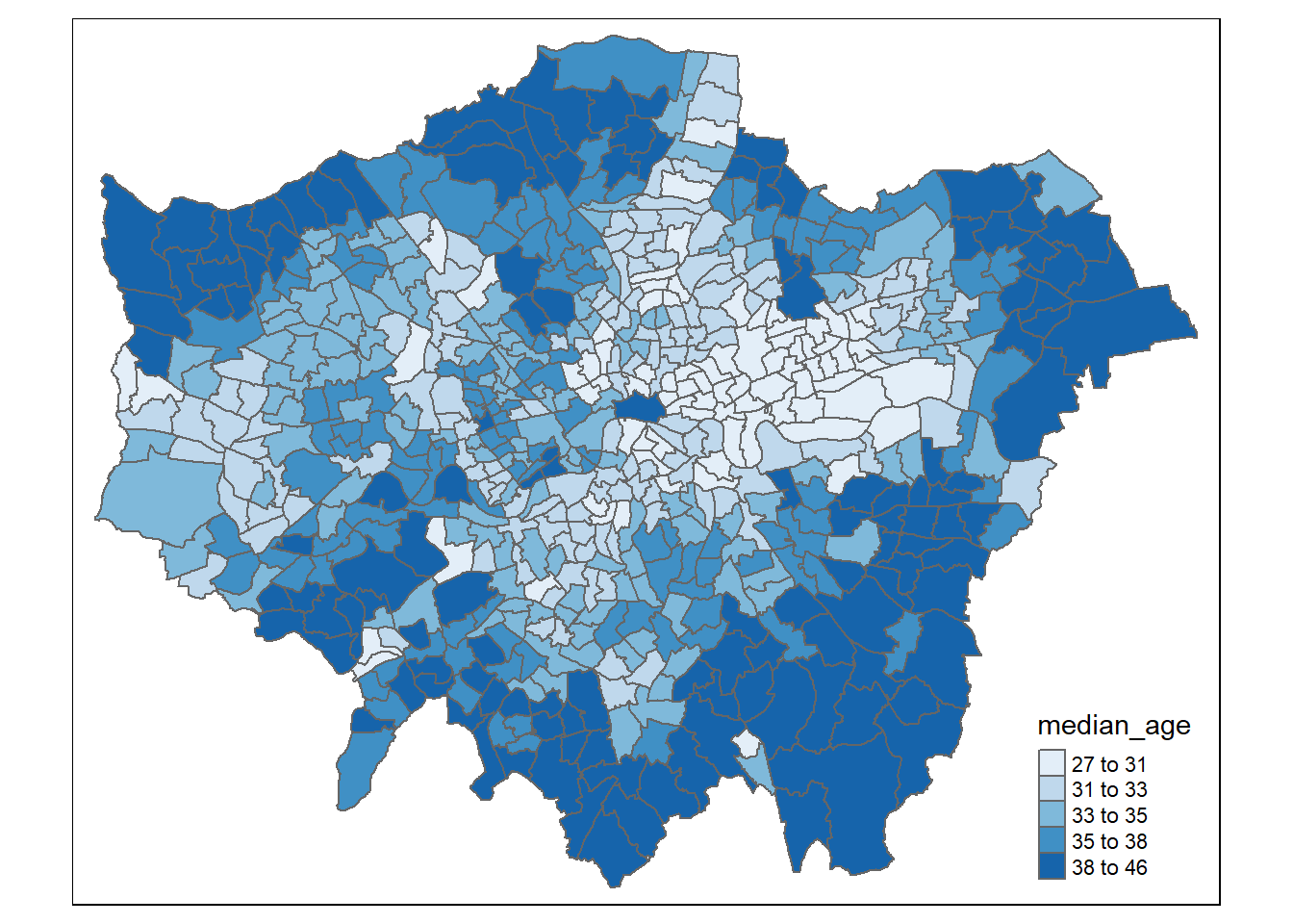
Figure 3.3: Plot of Median Age per ward in Greater London
Evident in Figure 3.3, younger populations are seen in more central areas, and particularly the “East End” of London. The median age is higher in those wards on the edge of Greater London that are perhaps quieter and where access to nature may be increased. Many of the wards with the highest median ages in the South of London, on the borders of Kent, Surrey and Sussex, as well as the North West, North and North East boundaries. There are some exceptions, notably areas of higher median income in the South-West such as Richmond also have higher median ages.
3.2.3 Life Expectancy
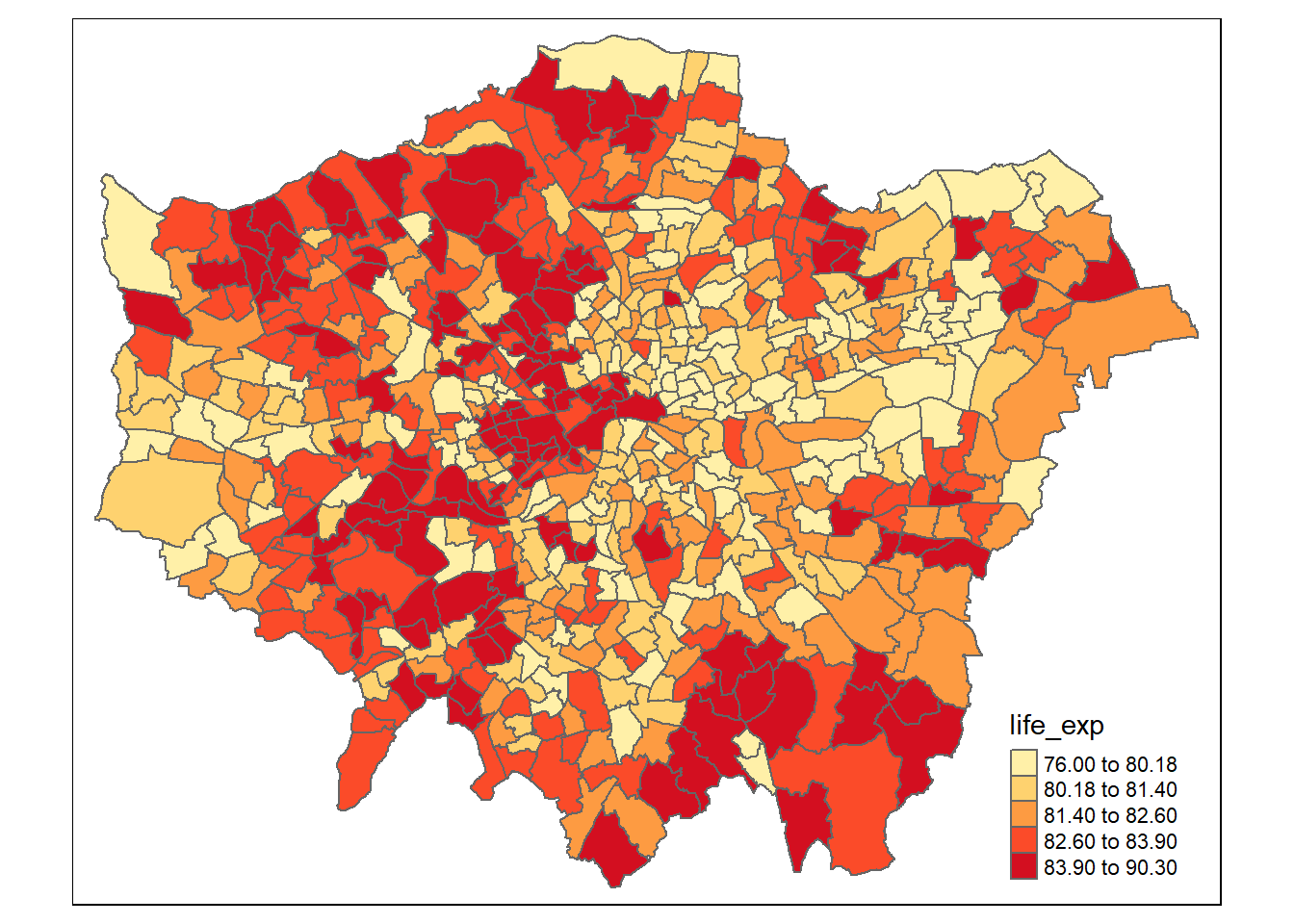
Figure 3.4: Plot of Life Expectancy per ward in Greater London
As seen in Figure 3.4, life expectancy is generally higher in the West than the East, with much of the East having a life expectancy below 80. The highest life expectancies are within Central London, towards affluent areas in the North such as Highgate, and the South West such as Kingston. Higher life expectancies can also be in areas of the South East on the border of Kent and East Sussex.
3.2.4 Ethnicity
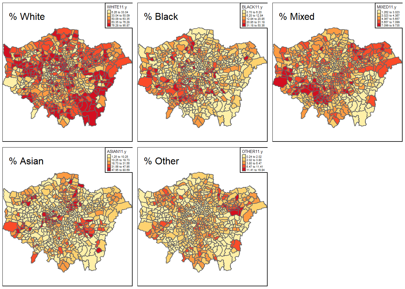
Figure 3.5: Plots of the ethnicity distribution per ward in Greater London
As evident in Figure 3.5, as of the 2011 census, Greater London has a large and diverse ethnic minority population with 18.4% of Londoners identifying as Asian/Asian British, 13.3% identifying as Black, 5% identifying as Mixed, and 3.4% identifying with Other ethnicities. The remaining 59.8% of Londoners identify as White. Areas with larger Black populations are concentrated around the east and south of London. For the Asian population, there is a great concentration around central London as well as the Lea Valley towards the North of London, with another cluster around South east London in the Lewisham area. The Mixed population represent less than 10% in all wards, but the distribution tends to be highly concentrated around south-west London and east London, with a significantly smaller Mixed population in the south-east. There are clusters of Other ethnicities around East London, particularly in the Stratford area and around the North West and Hillingdon area.
3.3 Spatial Autocorrelation
3.3.1 Global Moran’s I
Tests of spatial autocorrelation enable clear understanding of the extent to which neighbouring wards in Greater London are significantly clustered spatially. The Global Moran’s I was used to measure spatial autocorrelation between green space across every ward in London, by comparing the actual value for green space to a distance-weighted matrix of neighbours, returning a value between -1 and 1 (Houlden et al. (2019)). This is calculated through the following formula:
\(\Large I=\frac{n}{\sum_{i} \sum_{j} w_{i j}} \frac{\sum_{i} \sum_{j} w_{i j}\left(x_{i}-\bar{x}\right)\left(x_{j}-\bar{x}\right)}{\sum_{i}\left(x_{i}-\bar{x}\right)^{2}}\)
Where \(\Large n\) is the number of spatial locations; \(\Large x_1\) and \(\Large x_j\) are the values of the spatial process measured at every location \(\Large i\) and \(\Large j\), respectively; \(\Large \bar{x}\) represents the mean of \(\Large x\); \(\Large w_{ij}\) is the element of a spatial weight matrix \(\Large W\) giving the spatial weight between locations \(\Large i\) and \(\Large j\).
The Global Moran’s I across Greater London was 0.285, suggesting positive autocorrelation. For the Global Moran’s I statistic, the null hypothesis states that the spatial processes promoting the observed pattern of green space occur by random chance. To test this, we can use a Monte-Carlo simulation which uses a permutation test to examine how often the value of the observed statistic is seen through randomly chance.
The Monte-Carlo simulation of Moran’s I shows that the observed value of Moran’s I was higher than any of the 999 random permutations, and the observed value has a p-value of 0.001. This allows us to reject the null hypothesis. We can therefore conclude that, at the ward level in Greater London, green space is significantly positively autocorrelated.
3.3.2 Local Moran’s I
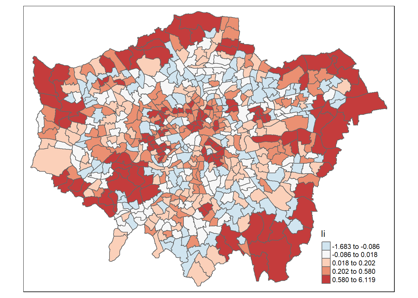
Figure 3.6: Plot of Local Moran’s I of Green Space in Greater London
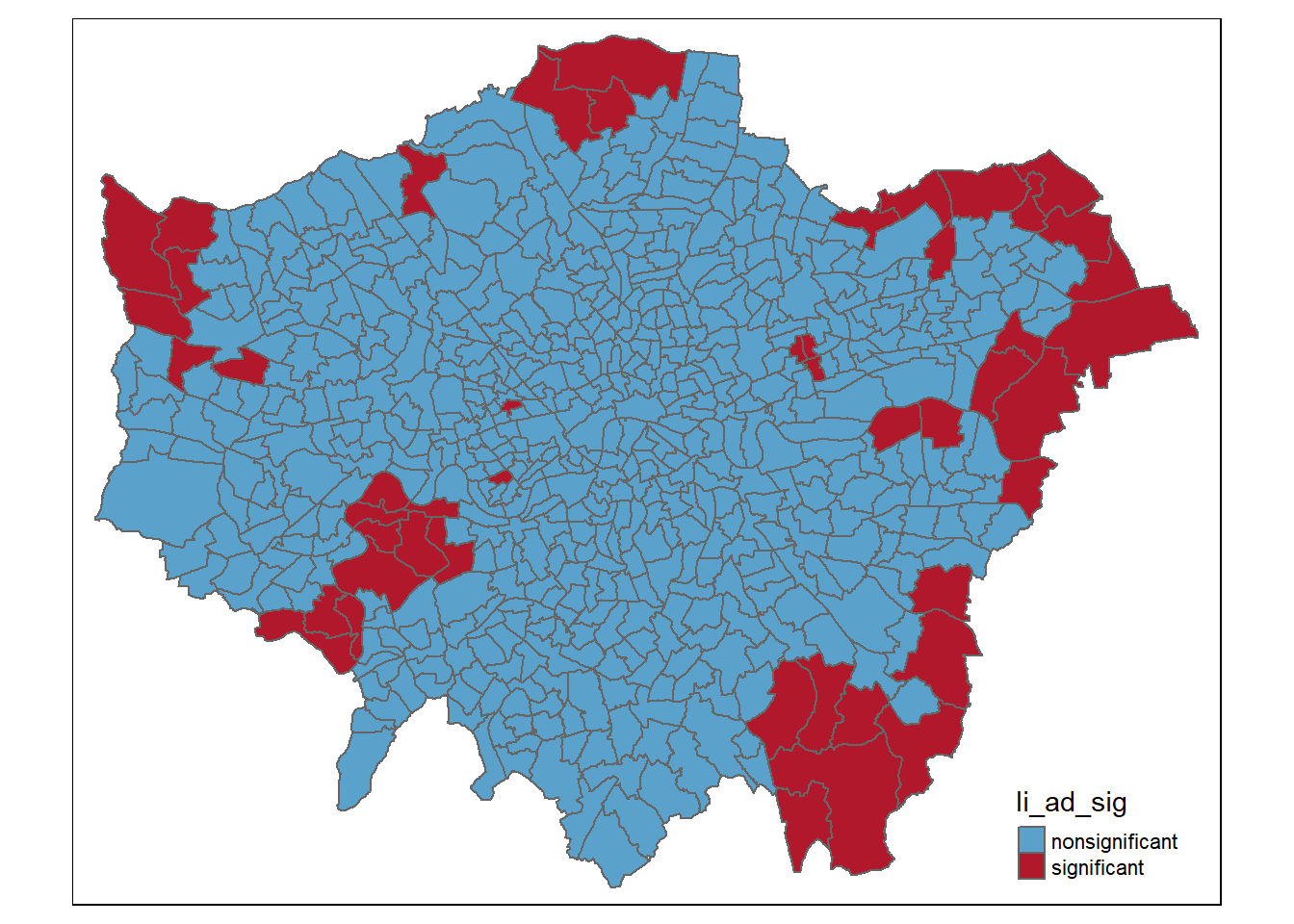
Figure 3.7: Plot of Significant and Non Significant Local Moran’s I Results in Greater London
In addition to the Global Moran’s I, it is useful to examine the Local Moran’s I (Figure 3.6 , Figure 3.7) which is a method to identify local clusters and local spatial outliers.
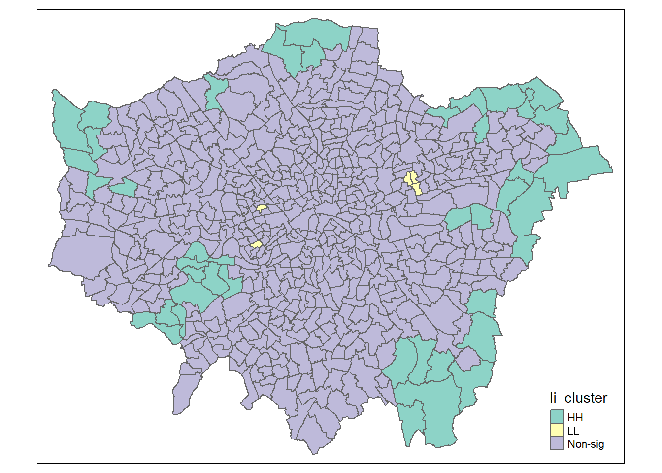
Figure 3.8: Plot of High-High and Low-Low Green Space Clusters in Greater London
Figure 3.8 shows significant High-High clusters around the perimeter of East, North and North-West London. The area around Richmond in the South West of London has a High-High cluster, presumably due to the presence of one of London’s largest parks (Richmond Park). In addition, there were clusters of Low-Low green space access, including around the highly urban wards of Boleyn, Green Street East and Green Street West.
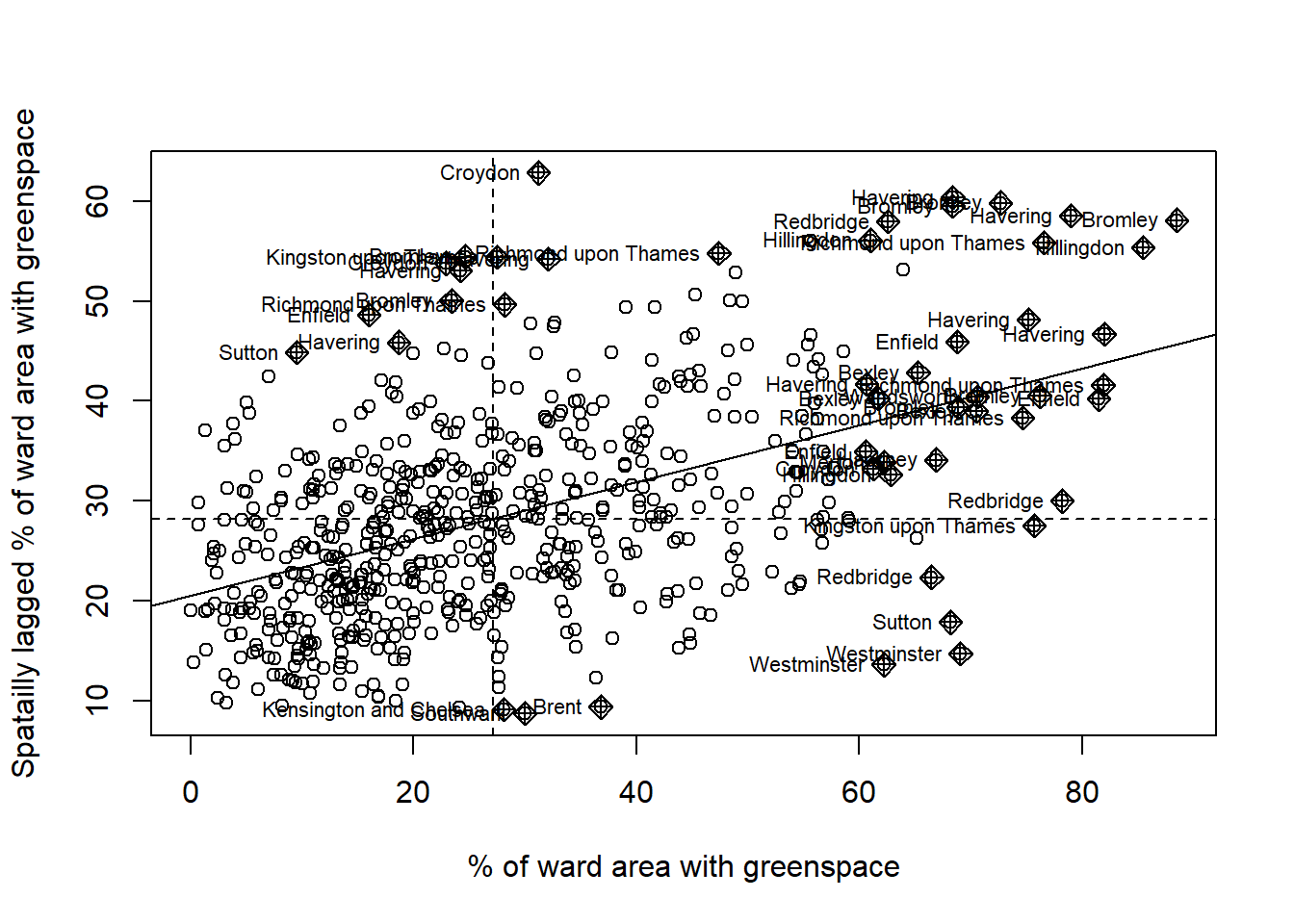
Figure 3.9: Moran scatterplot of Green Space
The Moran scatter plot shown in Figure 3.9 displays the % green space and London borough of each ward. Clustering of boroughs in areas of the scatterplot can be seen. This supports the High-High, Low-Low map in Figure 3.8.
3.3.3 Semivariogram
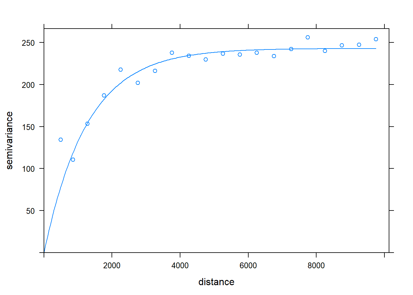
Figure 3.10: Greenspace semivariogram
A semivariogram examines how semi-variance increases with distance. From the semivariogram in Figure 3.10 we can see that the semi-variance increases up to a distance of around 4000m, at which point it levels off.